Portfolio Page 1
Healthcare Craft:
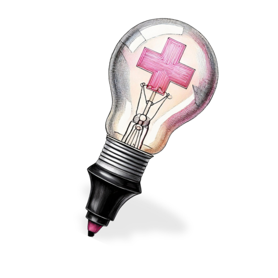
Branding, Design & Concept
Branding Case Study: Healthcare Craft
The Origin: Science, Style & Authenticity
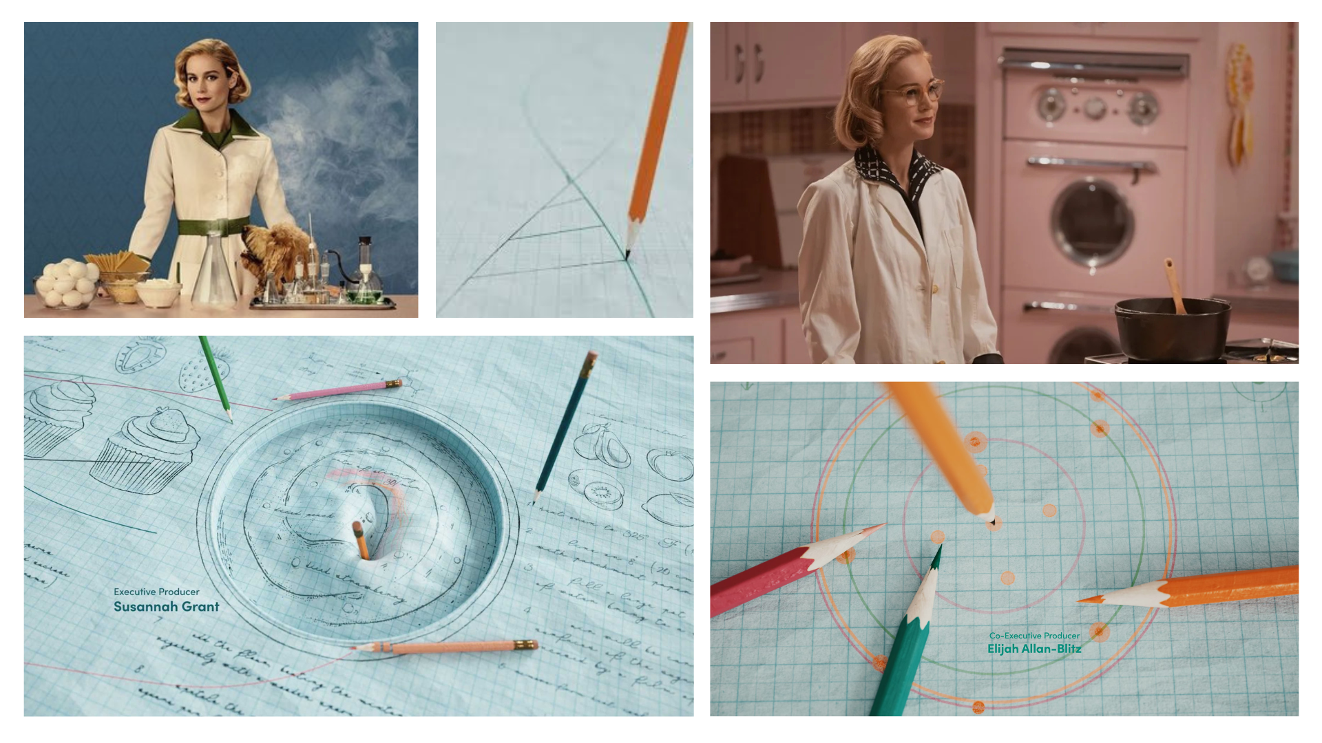
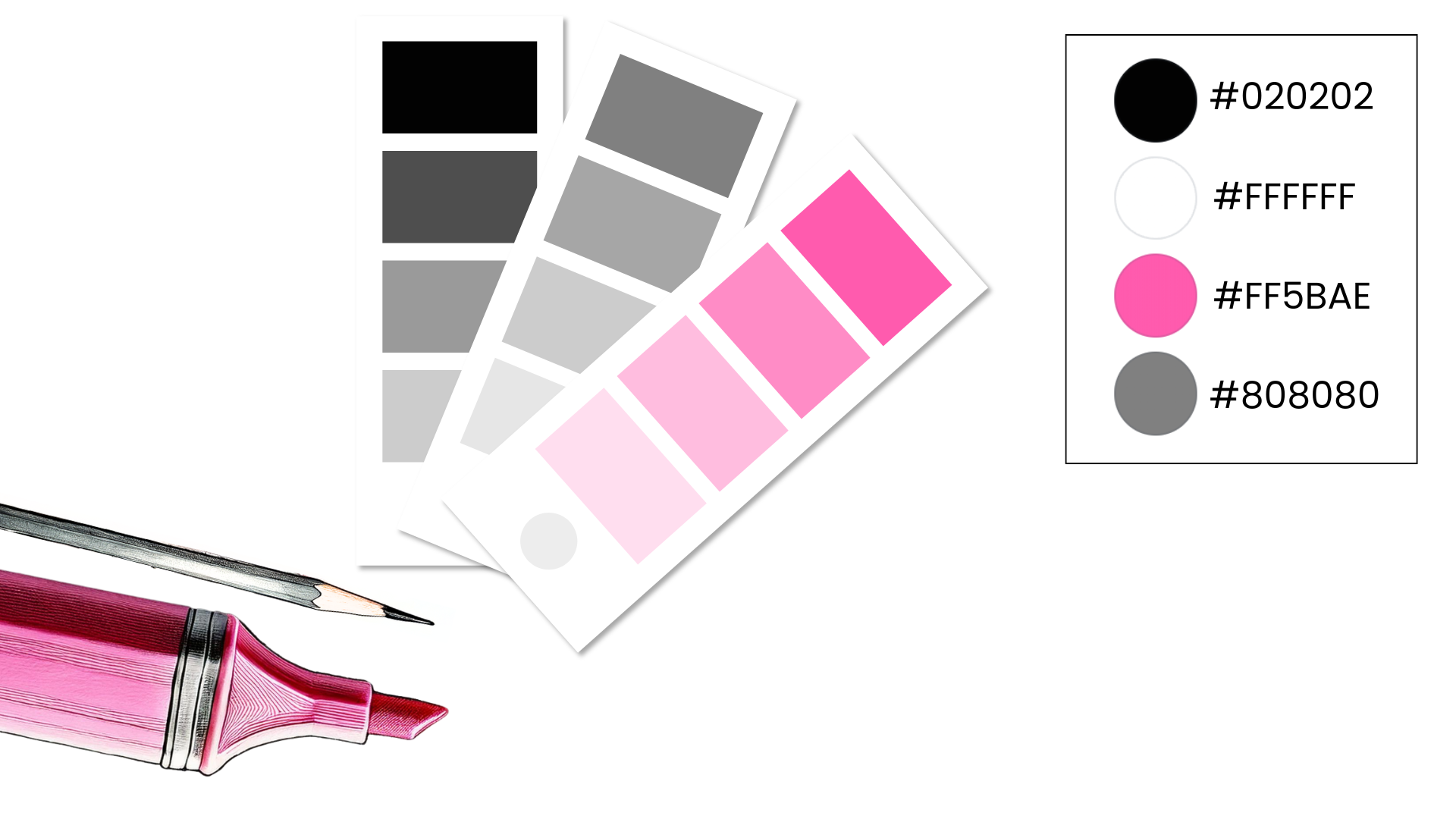
The Visual Mood: Vintage, Feminine, Unapologetically Pink
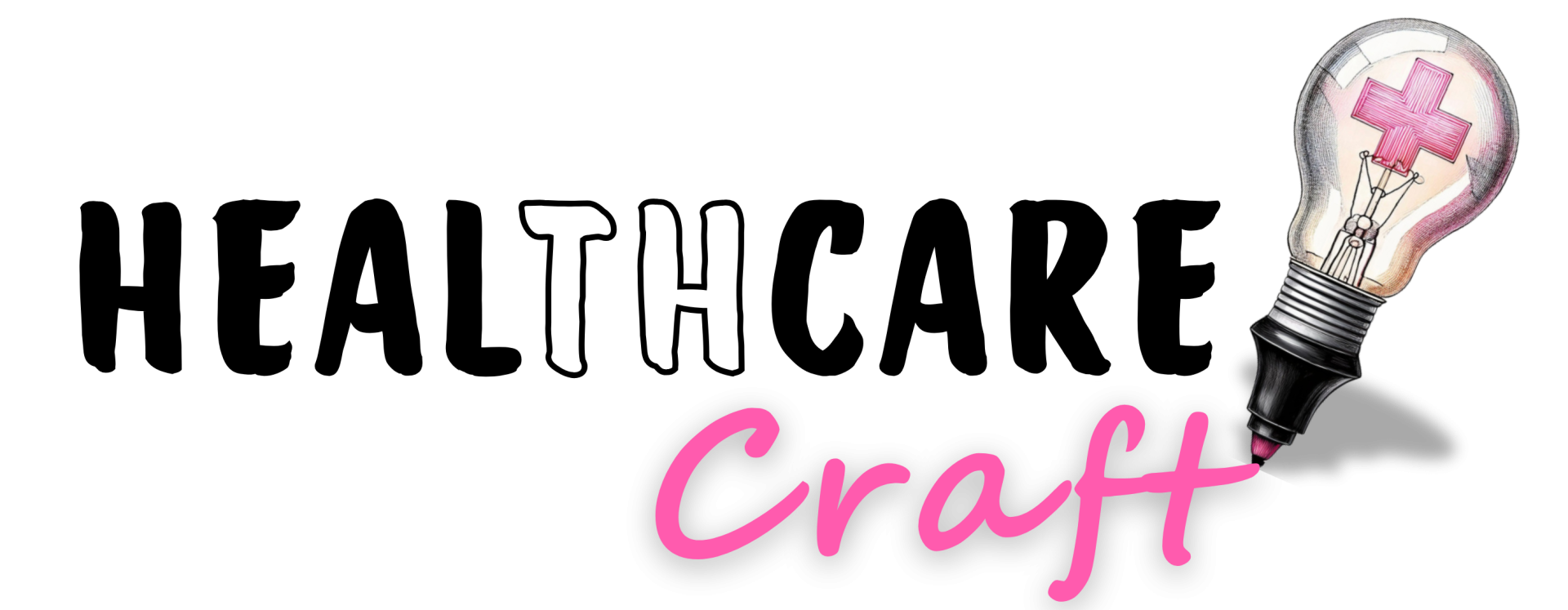
The Logo: A Story of Healing, Technology, and Craftsmanship


The Design Process: From Idea to Identity
Craft as a Philosophy
What This Brand Says (Without Saying a Word)
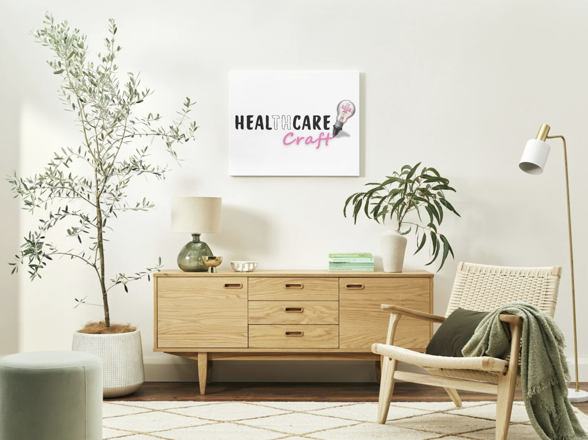
What You Can Expect If We Work Together
02
Moodboarding
04
Refining
In Summary
Featured links
Healthcare Craft
Created with